Pure Matcha Partners
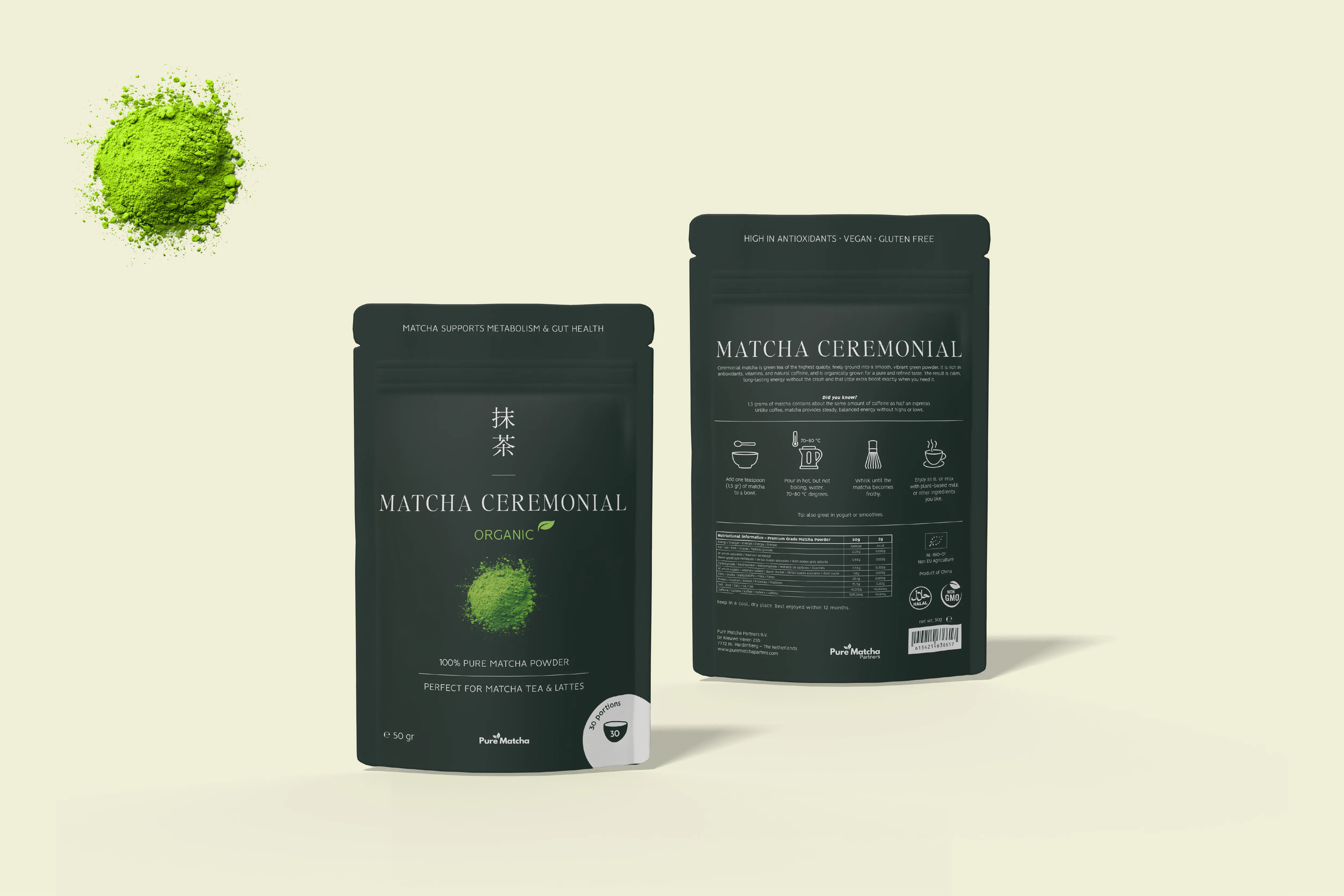
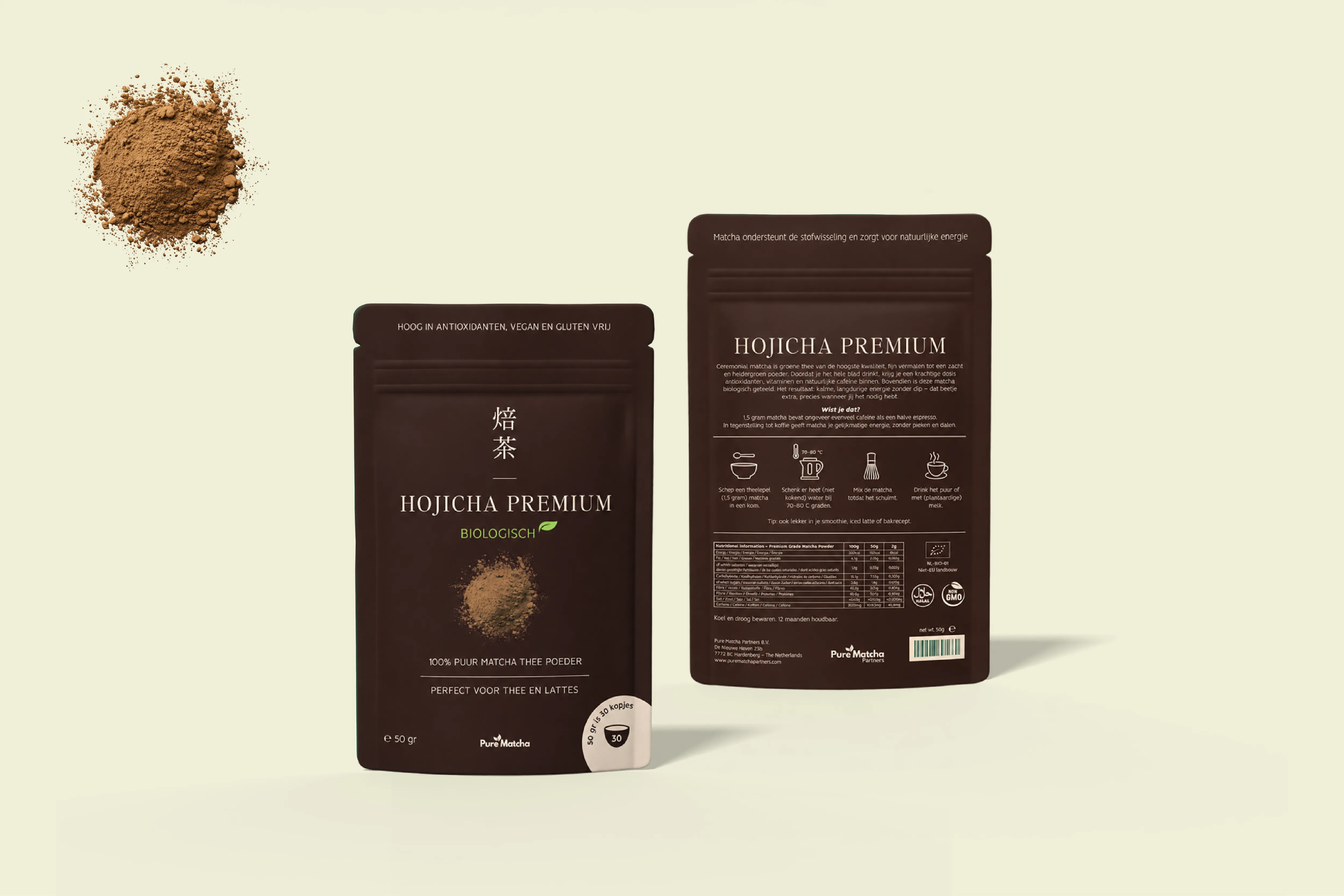
For Pure Matcha Partners we designed the packaging of two organic teas: Matcha Ceremonial grade and Hojicha. Each pouch pairs a refined serif title with the Japanese characters of the tea and a single heap of powder that shows exactly what is inside, so the two read as one family while each keeps its own colour.
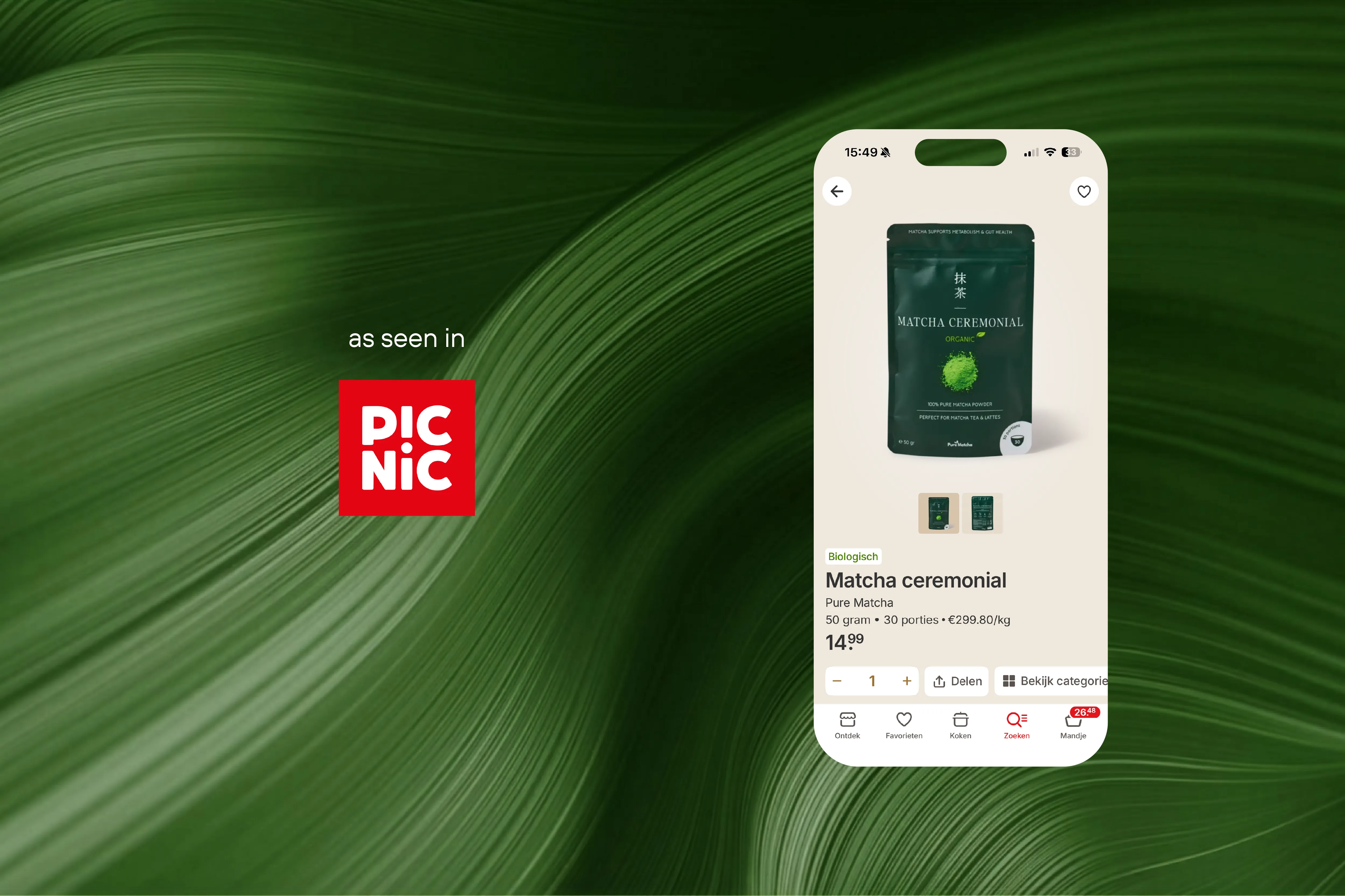
Colour tells the two teas apart. A deep, almost black green holds the Ceremonial matcha, while a dark cocoa brown sets the roasted Hojicha apart, its warm powder glowing against the pouch. The layout stays the same from one tea to the other, so each is recognisable at a glance, in the hand or on a phone screen.
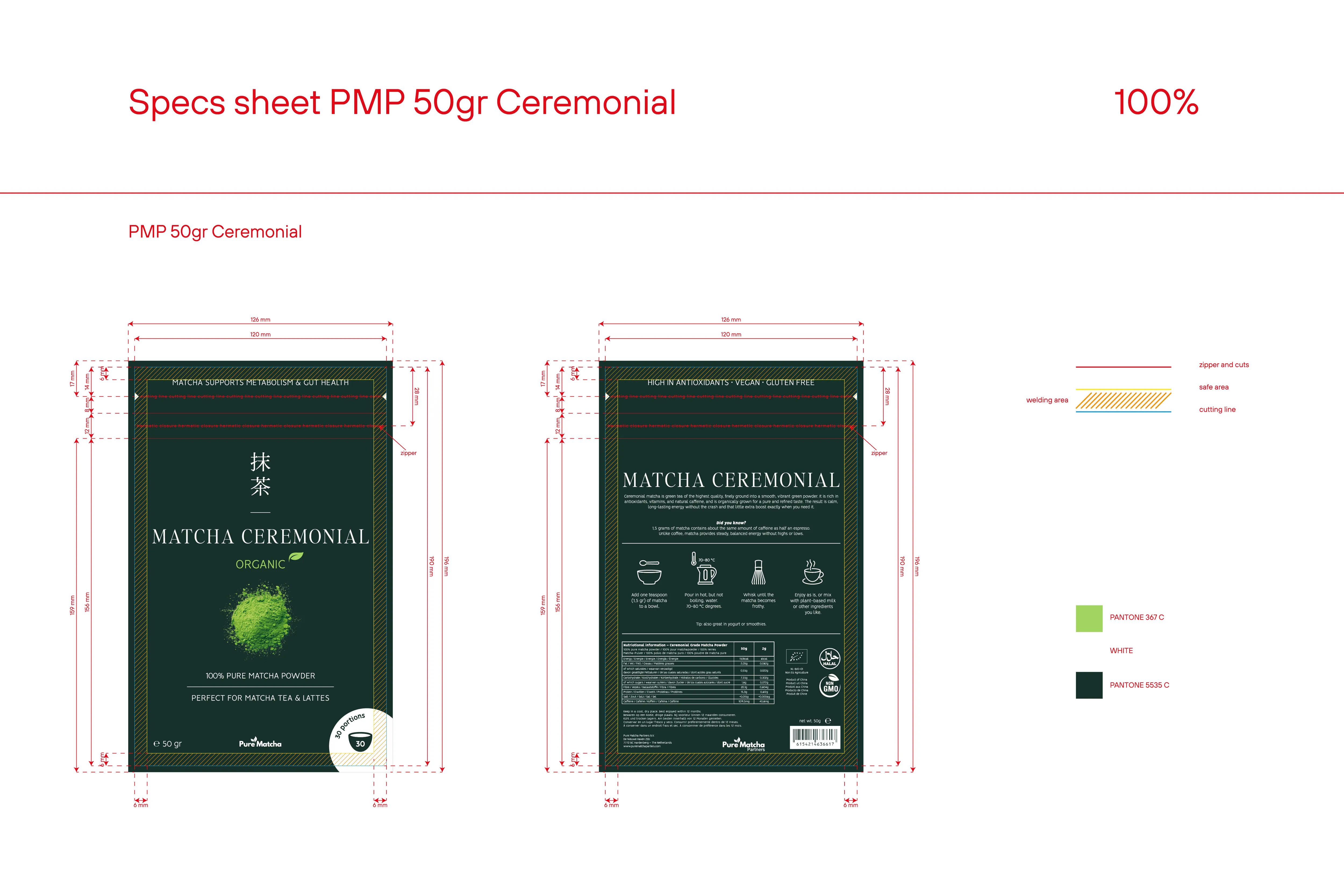
On the back, preparation becomes four illustrated steps, from the bowl and the water temperature to the whisk and the cup, followed by the nutrition table and the certifications. Every pouch was delivered print-ready, with die lines, safe areas and Pantone references for production.
Pure Matcha is sold at Picnic, the Dutch online supermarket that delivers groceries straight to customers’ doors.